14.2 More Flutter Features
# Filling in the Gaps
The content here is meant to help fill in the gaps in your knowledge about Flutter, to review important topics, and introduce other features that will help you build better apps.
# FadeInImage
The FadeInImage widget creates an image that shows a placeholder image while the target image is loading, then fades in the new image when it loads.
FadeInImage
Reference for the FadeInImage class
Pub.dev link to the transparent_image package
# Nullable Declarations, Null-aware Operator, and Null assertion
As you already know from the Dart Hybrid modules, a variable in Dart can be declared as allowed or not allowed to include null as a possible value.
String name1 = 'default'; //must have a value because null is not allowed
String? name2; //null is allowed so value can be assigned later
late String name3; //we are promising Dart that we will provide a value when the class
                  // gets instantiated... before it is needed. It won't be null.
2
3
4
So, in situations where a variable might contain null, we need to address this in our code.
Maybe we want to call a method that belongs to an Object but the Object might be null. To solve this problem we use the null-aware operator: ?..
int? result = myObject?.someMethod();
//check if myObject is null first.
//if myObject is null then assign null to result
//if myObject is not null then call the method and assign its return value to result.
2
3
4
Another situation occurs when a variable might have started out as null but along the way is assigned an actual value. Most of the time, Dart can figure out that the value has been provided. However, there are times where it won't be sure.
Your options are to start writing if statements to check if the object is null and dealing with it accordingly, or we can use the null assertion operator: !.
The null assertion operator is used by the developer to assure the compiler that an object is definitely NOT null. This lets the code compile and prevents the linter from complaining.
final _formKey = GlobalKey<FormState>();
//...

ElevatedButton(
  onPressed: () {
    // Validate returns true if the form is valid, or false otherwise.
    if (_formKey.currentState!.validate()) {
      //validation functions all returned null
      //validation has been passed so we can save the form
      _formKey.currentState!.save();
    }else{
      //failed validation
    }
)
2
3
4
5
6
7
8
9
10
11
12
13
14
A common place to see this is when you are writing your code to validate forms and you need the currentState property of your GlobalKey<FormState> to be not null in order to trigger the
validator or the onSave functions in the TextFormFields. Dart is not sure if that formKey has been assigned to the form and if the it has any TextFormFields attached to it. We have to promise
that it is properly configured.
If the currentState property ends up being null then you will have a runtime error that crashes your app.
# kDebugMode
There is a top level constant in Flutter that allows you to know if your app is running in "debug mode". It is automatically set to true or false.
Use it to wrap things like print() statements that should never be part of your production code.
if(kDebugMode){
  print('yep my app is running in debug mode!');
}
2
3
# AlertDialog
See the notes in Module 11.2.
# Image Fallbacks and Errors
See the notes in Module 10.1 under the heading Images. Look for the notes about the errorBuilder and the loaderBuilder.
# SVG Images
If you want to load an SVG image in your app instead of a binary image, which gets loaded with Image.asset(), Image.network(), or Image.memory() then you will want to include the flutter_svg
package from pub.dev in your pubspec.yaml file.
With that installed, you can use the SvgPicture widget to load your SVG image. It has both asset and network named constructors, just like an Image widget.
import 'package:flutter_svg/flutter_svg.dart';

final String assetName = 'assets/logo.svg';
final Widget svg = SvgPicture.asset(
  assetName,
  semanticsLabel: 'Company Logo'
);

final Widget networkSvg = SvgPicture.network(
  'https://site-that-takes-a-while.com/image.svg',
  semanticsLabel: 'A shark?!',
  placeholderBuilder: (BuildContext context) => Container(
      padding: const EdgeInsets.all(30.0),
      child: const CircularProgressIndicator()),
);
2
3
4
5
6
7
8
9
10
11
12
13
14
15
Here is the reference site for flutter_svg
# Launching URLS
If you ever need to include the ability to open links in a browser(or other app), from within your application, you can achieve this with the url_launcher package.
import 'package:flutter/material.dart';
import 'package:url_launcher/url_launcher.dart';

final Uri _url = Uri.parse('https://flutter.dev');

void main() => runApp(
  const MaterialApp(
    home: Material(
      child: Center(
        child: ElevatedButton(
          onPressed: _launchUrl,
          child: Text('Show Flutter homepage'),
        ),
      ),
    ),
  ),
);

Future<void> _launchUrl() async {
  if (!await launchUrl(_url)) {
    //call the async launchUrl method from the url_launcher package
    throw Exception('Could not launch $_url');
  }
}
2
3
4
5
6
7
8
9
10
11
12
13
14
15
16
17
18
19
20
21
22
23
24
Reference page for url_launcher package on pub.dev
# Flutter Hooks
Full 2-hour video course on using Flutter Hooks
[more notes coming soon]
Flutter Hooks package page on pub.dev
# Application Lifecycle
The Application Lifecycle is the standard steps that any application goes through to launch, become active, be put into the background, and being shut down.
We can use the Flutter Hooks package and the useAppLifecycleState or useOnAppLifecycleStateChange hooks to listen for these state changes in our code.
As of Flutter version 3.13.x there is a new class called AppLifecycleListener. We can use this to manage movement between the different lifecycle states.
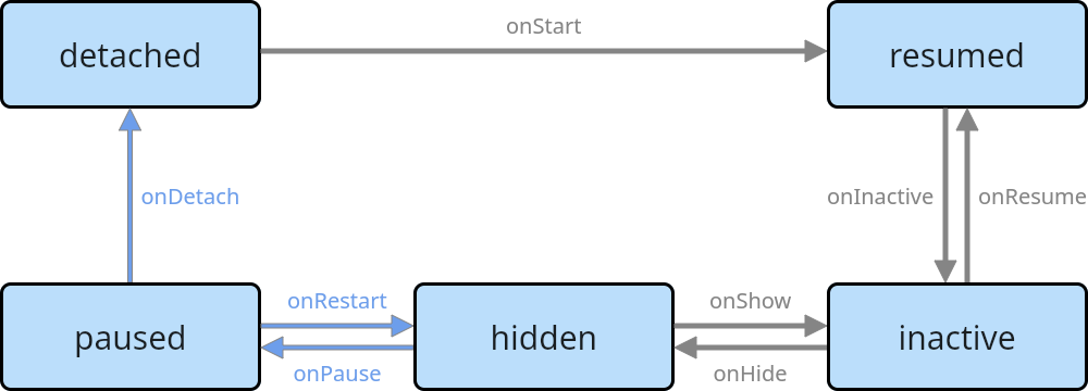
Here is the sample code from the documentation that shows how the new AppLifecycleListener class works.
import 'package:flutter/foundation.dart';
import 'package:flutter/material.dart';
void main() {
runApp(const MyApp());
}
class MyApp extends StatefulWidget {
const MyApp({super.key});
State<MyApp> createState() => _MyAppState();
}
class _MyAppState extends State<MyApp> {
late final AppLifecycleListener _listener;
Color bg = Colors.amber;
void initState() {
super.initState();
// Initialize the AppLifecycleListener class and pass callbacks
_listener = AppLifecycleListener(
onStateChange: _onStateChanged,
);
}
void dispose() {
// Do not forget to dispose the listener
_listener.dispose();
super.dispose();
}
// Listen to the app lifecycle state changes
void _onStateChanged(AppLifecycleState state) {
switch (state) {
case AppLifecycleState.detached:
if (kDebugMode) {
print('detached');
}
setState(() {
bg = Colors.blue;
});
break;
case AppLifecycleState.resumed:
if (kDebugMode) {
print('resumed');
}
setState(() {
bg = Colors.green;
});
break;
case AppLifecycleState.inactive:
if (kDebugMode) {
print('inactive');
}
setState(() {
bg = Colors.pink;
});
break;
case AppLifecycleState.hidden:
if (kDebugMode) {
print('hidden');
}
setState(() {
bg = Colors.yellow;
});
break;
case AppLifecycleState.paused:
if (kDebugMode) {
print('paused');
}
setState(() {
bg = Colors.purple;
});
}
}
Widget build(BuildContext context) {
return MaterialApp(
home: Scaffold(
body: Container(
color: bg,
child: Center(
child: Text('BG: $bg \n\n Flutter version: ${Platform.version}',
style: Theme.of(context).textTheme.displayMedium),
),
),
),
);
}
}
2
3
4
5
6
7
8
9
10
11
12
13
14
15
16
17
18
19
20
21
22
23
24
25
26
27
28
29
30
31
32
33
34
35
36
37
38
39
40
41
42
43
44
45
46
47
48
49
50
51
52
53
54
55
56
57
58
59
60
61
62
63
64
65
66
67
68
69
70
71
72
73
74
75
76
77
78
79
80
81
82
83
84
85
86
87
88
89
90
91
92
93
94
95
96
If you use the above code as your main.dart file, launch it in a simulator and you will see the default Colors.amber background. Then, once it is running, click the Home button. In the
Debug Console you should see:
flutter inactive
flutter: hidden
flutter: paused
2
3
Then click on the launcher icon again to bring the app back. In the Debug Console you will see:
flutter: hidden
flutter: inactive
flutter: resumed
2
3
You will get the same sequence of lifecycle event messages for Android. When the app returns to the foreground (resumed) then you will see the Colors.green background set.
If you double click the home button or click on the Android square button, to show the list of apps that have been launched and not shut down, you will also see the Colors.pink background color on
the app.
Here is a written tutorial on using the new AppLifecycleListener
Reference page for AppLifecycleListener
# GlobalKey vs ValueKey
The GlobalKey() constructor we have already used in conjunction with Form widgets. It creates a key that can be used and viewed globally within the app. It creates a key, potentially with an
attached state object that is guaranteed to be unique within your entire application.
There is also a ValueKey() constructor which will create a key that is guaranteed to be unique within the current build method. These are useful for things like items inside a ListView, when
they need keys so you can rearrange them or remove and readd them.
As an example, here is a snippet for a ListView that can be reordered.
child: ReOrderableListView.builder(
  itemCount: items.count,
  onReorder: (oldindex, newindex) => setState(() {
    final index = newindex > oldindex ? newindex -1 : newindex;
    final item = items.removeAt(oldindex);
    items.insert(item);
  }),
  itemBuilder: (BuildContext context, int index){
    final item = items[index];
    final key = '${index}-${item['title']};'
    return ListTile(
      key: ValueKey(key),
      title: item['title'],
    );
  }
)
2
3
4
5
6
7
8
9
10
11
12
13
14
15
16
The ReOrderableListView has the onReorder method that runs each time the user drags a list item far enough to change its position.
# BoxConstraints
In Flutter, widget constraints play a fundamental role in how the layout system determines the size and position of widgets within the UI. Constraints are used to define the limits and rules that widgets must follow when they are rendered on the screen. These constraints influence how widgets size themselves, position themselves within their parent, and handle overflow.
Here's an overview of how widget constraints work:
- Minimum and Maximum Constraints:
- Widgets in Flutter receive constraints from their parent widget, defining the minimum and maximum sizes they can occupy.
- The parent widget provides these constraints based on its own size constraints and layout rules, such as BoxConstraints or MediaQuery.
- Intrinsic Sizing:
- Widgets have their intrinsic sizing behavior, determining their preferred size based on their content or specified constraints.
- Some widgets have inherent sizes based on their content (e.g., text, images), while others adapt their sizes based on the available space.
- Layout Constraints:
- Widgets respect the constraints provided by their parent and attempt to size themselves within these constraints.
- Widgets use their
constraintsparameter to communicate their preferred size to their parent, considering the incoming constraints.
- Layout Algorithms:
- Flutter's layout system calculates the sizes and positions of widgets based on the constraints passed down by their parent.
- Widgets use layout algorithms like Flex, Column, Row, Stack, etc., to arrange their children while considering their constraints.
- Overflow Handling:
- If a child widget attempts to exceed the constraints provided by its parent (e.g., tries to be larger than the available space), overflow behavior occurs.
- Overflow can be managed using techniques like ClipRect, OverflowBox, or FittedBox to handle situations where a widget's size exceeds its constraints.
- Unbounded Constraints:
- Widgets can also receive unbounded constraints, indicating that they can freely size themselves without specific limits.
- Widgets like ListView or SingleChildScrollView typically provide unbounded constraints to their children, allowing them to scroll and expand as needed.
Widgets use constraints to determine their size, and the parent widget manages these constraints to arrange its children appropriately within the available space.
# MaterialStateProperties and MaterialStateColor
Material state properties represent values that depend on a widget's material "state". The state is encoded as a set of MaterialState values, like MaterialState.focused, MaterialState.hovered, MaterialState.disabled, MaterialState.pressed, etc.
In early versions of Flutter, when you added a button, you would have to add a list of color properties - color, hover, active, etc. the Button Style needed all those individual properties.
The newer approach is to create a single property that adapts to the widget state. Buttons is the most common example of this, but there a many widgets that can use the newer Material State Properties.
Here is an example using a MaterialStateProperty<Color?>?. This is a Material State Property of type Color. Both the Color and the Material State Property are nullable. In our ElevatedButton, the
style property needs a ButtonStyle widget. This widget has a backgroundColor: property that needs our MaterialStateProperty<Color?>?.
ElevatedButton(
  child: Text('click me'),
  style: ButtonStyle(
    backgroundColor: MaterialStateProperty.resolveWith( getColor ),
  ),
)
2
3
4
5
6
The above example uses the lengthy version MaterialStateProperty.resolveWith(getColor). The getColor parameter is a function like the following which allows you to set specific colors for specific
states.
//this function would sit inside your build method
//SEE THE VIDEO for a way to make this function globally available
//and remove it from the build methods.
Color? getColor(Set<MaterialState> states){
  //accept a Set of the current Material states from a Widget
  //check for different states to select specific colors
  if(states.contains(MaterialState.focused) && states.contains(MaterialState.hovered){
    //widget is both focused and hovered
    return Colors.red;
  }else if(states.contains(MaterialState.focused)){
    //only focused
    return Colors.blue;
  }else if(states.contains(MaterialState.hovered)){
    //only hovered
    return Colors.orange;
  }else{
    //any other states
    return Colors.purple;
  }
}
2
3
4
5
6
7
8
9
10
11
12
13
14
15
16
17
18
19
20
The shorter way of writing this, when you only want one color is to use MaterialStateProperty.all(Colors.blue). The first version determines the state and returns the appropriate color from the
ColorScheme. The second shorter version returns a single color for ALL states.
Another alternative would be to use the following approach, which allows us to create a button style object specifically for our type of button. It gets a Button Style object from the Theme and lets us override properties like backgroundColor.
ElevatedButton(
  child: Text('click me'),
  style: ElevatedButton.styleFrom(
    backgroundColor: Colors.blue,
  ),
)
2
3
4
5
6
Material State Properties
MaterialStateColor class reference MaterialStateProperties class reference
# OrientationBuilder
In Flutter, you can detect changes in device orientation using the OrientationBuilder widget or by listening to the onOrientationChanged event provided by the DeviceOrientation enum from the
package:flutter/services.dart package. The OrientationBuilder widget rebuilds its child widget every time the device orientation changes.
import 'package:flutter/material.dart';
class MyApp extends StatelessWidget {
Widget build(BuildContext context) {
return MaterialApp(
home: OrientationBuilder(
builder: (context, orientation) {
return Scaffold(
appBar: AppBar(
title: Text('Orientation Example'),
),
body: Center(
child: Text(
'Current orientation: $orientation',
style: TextStyle(fontSize: 20.0),
),
),
);
},
),
);
}
}
2
3
4
5
6
7
8
9
10
11
12
13
14
15
16
17
18
19
20
21
22
23
24
Possible values for the orientation are: Orientation.portrait, Orientation.landscapeRight, Orientation.landscapeLeft, Orientation.portraitUp, and Orientation.portraitDown.
Listening for a change in orientation requires no more work really. The function assigned to the builder: property of the OrientationBuilder() widget will automatically be called when the
orientation changes to an allowed value. Just use a ternary statement for different widget tree creation.
If you want to lock your application's orientation to a specific direction then you can wrap the runApp() call in the main function like this:
void main() {
  WidgetsFlutterBinding.ensureInitialized();
  //without this first line you will get an error when trying to lock the orientation
  SystemChrome.setPreferredOrientations([
    DeviceOrientation.portraitUp,
  ]);
  runApp(const MyApp());
}
2
3
4
5
6
7
8
# International Intl Package
[notes coming soon]
# Cupertino Apps and Themes
When you want to build an app that is based on the Cupertino design language instead of Material Design, start by importing a different package than material.dart on each page.
import 'package:flutter/cupertino.dart';

void main(){
  runApp(MyCupertinoApp());
}
2
3
4
5
Then you can build the top level widget with CupertinoApp() instead of MaterialApp(). It has a similar home property that will hold a CupertinoPageScaffold() instead of a Scaffold().
Here is a basic example. Note the CupertinoThemeData, CupertinoColors, CupertinoNavigationBar and CupertinoIcons. Each is slightly different from the Material Design version. The navigation
bar at the bottom is attached to the scaffold's tabBar property. It uses a CupertinoTabBar which has items and a tabBuilder properties.
class MyCupertinoApp extends StatelessWidget {
Widget build(BuildContext context){
return const CupertinoApp(
theme: CupertinoThemeData(
brightness: Brightness.dark,
primaryColor: CupertinoColors.systemOrange,
),
home: CupertinoPageScaffold(
navigationBar: CupertinoNavigationBar(
middle: Text('Home'),
),
child: Center(child: Icon(CupertinoIcons.share)),
tabBar: CupertinoTabBar(
items: const <BottomNavigationBarItem>[
BottomNavigationBarItem(
icon: Icon(CupertinoIcons.home),
label: 'Products',
),
BottomNavigationBarItem(
icon: Icon(CupertinoIcons.search),
label: 'Search',
),
BottomNavigationBarItem(
icon: Icon(CupertinoIcons.shopping_cart),
label: 'Cart',
),
],
),
tabBuilder: (context, index) {
return switch (index) {
0 => CupertinoTabView(
builder: (context) => const CupertinoPageScaffold(
child: ProductListTab(),
),
),
1 => CupertinoTabView(
builder: (context) => const CupertinoPageScaffold(
child: SearchTab(),
),
),
2 => CupertinoTabView(
builder: (context) => const CupertinoPageScaffold(
child: ShoppingCartTab(),
),
),
_ => throw Exception('Invalid index $index'),
};
},
),
)
}
}
2
3
4
5
6
7
8
9
10
11
12
13
14
15
16
17
18
19
20
21
22
23
24
25
26
27
28
29
30
31
32
33
34
35
36
37
38
39
40
41
42
43
44
45
46
47
48
49
50
51
52
53
54
Many of the classes that you would use for your Cupertino app are going to be the exact same as you would use for a Material Design App. The names of the widgets and their properties will be the same.
Here is a guide to building a Cupertino based Flutter App
# What to do this week
TODO Things to do before next week
- Work on your Final Project