React Components, Props, & Refs
# What is a component?
When building applications with React, think about how to break down your UI (user interface) design into small widgets. Fundamentally, React Components (opens new window) are just special JavaScript functions that returns some JSX composed of one or more React Elements (opens new window) to describe the look and behaviour of one of those widgets.
These component functions accept a single argument, which is an object called props.
function GreetPerson(props) {
  return <h1>Hello {props.name}</h1>;
}
2
3
The component can then be used by name like a custom HTML element in JSX. The name property gets passed into the function by setting an attribute on that custom component when the component is used in some other function's JSX.
function WelcomePage() {
  return (
    <main>
      <GreetPerson name="Mickey" />
      <p>
        Lorem, ipsum dolor sit amet consectetur adipisicing elit. Recusandae
        quas quis quia incidunt illum aut culpa omnis. Dicta fugit sapiente
        dolor eveniet numquam, cum provident recusandae mollitia. Illo, qui a.
      </p>
    </main>
  );
}
2
3
4
5
6
7
8
9
10
11
12
PascalCase component names
React component names should always start with an upper-case letter. Otherwise the JSX interpreter will think it is a regular HTML element and not compile it correctly.
# Default App component
The basic scaffolding for a React project website starts in /src/index.js where it imports the top level application component, usually called App.js, and mounts it to the DOM using the ReactDOM.render() method.
import React from 'react';
import ReactDOM from 'react-dom';
import './index.css';
import App from './App';

ReactDOM.render(<App />, document.getElementById('root'));
2
3
4
5
6
TIP
See how the App component is rendered as JSX like <App />.
The /src/App.js module is the top-level ancestor component from which all other application components will descend. We typically talk about "composing the UI", meaning that we assemble all of the various components like building blocks to describe the complete user interface.
import React from 'react';
import logo from './logo.svg';
import './App.css';

function App() {
  return (
    <div className="App">
      <header className="App-header">
        <img src={logo} className="App-logo" alt="logo" />
        <p>
          Edit <code>src/App.js</code> and save to reload.
        </p>
        <a
          className="App-link"
          href="https://reactjs.org"
          target="_blank"
          rel="noopener noreferrer"
        >
          Learn React
        </a>
      </header>
    </div>
  );
}

export default App;
2
3
4
5
6
7
8
9
10
11
12
13
14
15
16
17
18
19
20
21
22
23
24
25
26
# Decomposing a design
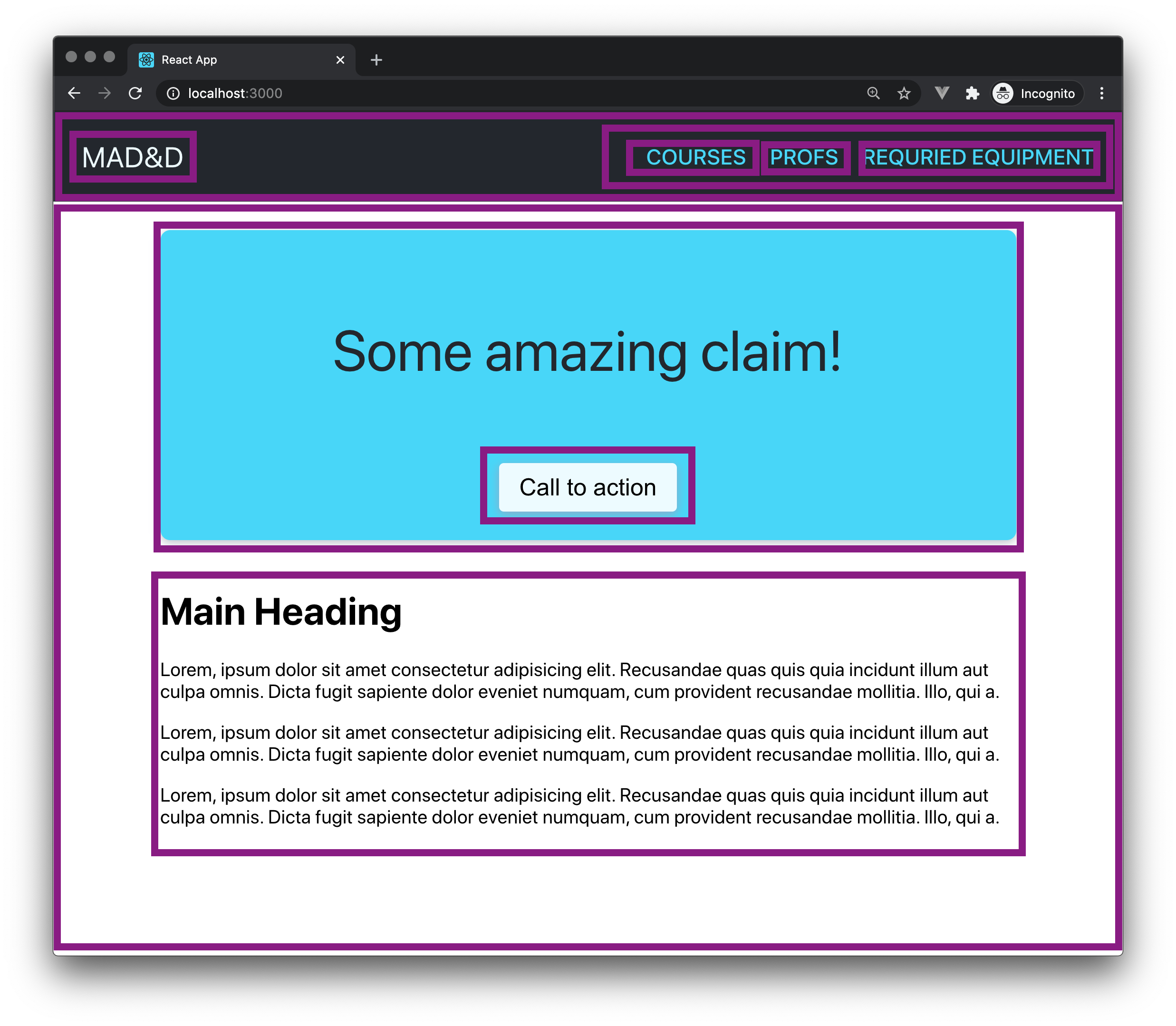
Let's start with a simple website layout and walk through the process of building this with React.

# What is the structure?

header
- logo
- nav
- nav-link
content-body
hero
- p
- button
main
- h1
- p * 3
# Start in the App component
Build out the JSX for this layout entirely in the App component, for now.
import React from 'react';
import './App.css';

function App() {
  return (
    <div className="App">
      <header className="App-header">
        <div className="App-logo">MAD&D</div>
        <nav className="TopNav">
          <a href="#" className="TopNav-link">
            Courses
          </a>
          <a href="#" className="TopNav-link">
            Profs
          </a>
          <a href="#" className="TopNav-link">
            Required Equipment
          </a>
        </nav>
      </header>
      <div className="App-body">
        <div className="HeroBlock">
          <p>Some amazing claim!</p>
          <button className="HeroBlock-button">Call to action</button>
        </div>
        <main>
          <h1>Main Heading</h1>
          <p>
            Lorem, ipsum dolor sit amet consectetur adipisicing elit. Recusandae
            quas quis quia incidunt illum aut culpa omnis. Dicta fugit sapiente
            dolor eveniet numquam, cum provident recusandae mollitia. Illo, qui
            a.
          </p>
          <p>
            Lorem, ipsum dolor sit amet consectetur adipisicing elit. Recusandae
            quas quis quia incidunt illum aut culpa omnis. Dicta fugit sapiente
            dolor eveniet numquam, cum provident recusandae mollitia. Illo, qui
            a.
          </p>
          <p>
            Lorem, ipsum dolor sit amet consectetur adipisicing elit. Recusandae
            quas quis quia incidunt illum aut culpa omnis. Dicta fugit sapiente
            dolor eveniet numquam, cum provident recusandae mollitia. Illo, qui
            a.
          </p>
        </main>
      </div>
    </div>
  );
}

export default App;
2
3
4
5
6
7
8
9
10
11
12
13
14
15
16
17
18
19
20
21
22
23
24
25
26
27
28
29
30
31
32
33
34
35
36
37
38
39
40
41
42
43
44
45
46
47
48
49
50
51
52
OK. That is the basic structure, but let's add some CSS to the App.css file so that it looks usable.
.App-logo {
  font-size: 1.5rem;
  pointer-events: none;
}

.App-header {
  background-color: hsl(220, 13%, 18%);
  color: hsl(193, 95%, 97%);
  display: flex;
  align-items: center;
  justify-content: space-between;
  padding: 1.5rem;
}

.TopNav {
  display: flex;
  align-items: center;
  justify-content: flex-end;
}
.TopNav-link {
  color: hsl(193, 95%, 68%);
  font-size: 1.125rem;
  font-weight: 500;
  margin-left: 1.25rem;
  letter-spacing: 0.125px;
  text-decoration: none;
  text-transform: uppercase;
}

.App-body {
  max-width: 80vw;
  margin: 0 auto;
}

.HeroBlock {
  background-color: hsl(193, 95%, 68%);
  border-radius: 0.5rem;
  box-shadow: 0 2px 8px 0 hsl(220, 13%, 78%);
  color: hsl(220, 13%, 18%);
  font-size: 3rem;
  margin: 1.5rem 0;
  padding: 1.5rem;
  text-align: center;
}

main {
  margin-top: 2.5rem;
}

.HeroBlock-button {
  background-color: hsl(193, 95%, 97%);
  border-radius: 0.25rem;
  border: 1px solid transparent;
  box-shadow: 0 2px 8px 0 hsl(220, 30%, 72%);
  font-size: 1.25rem;
  padding: 0.5rem 1rem;
}
.HeroBlock-button:focus,
.HeroBlock-button:hover {
  background-color: hsl(220, 13%, 18%);
  color: hsl(193, 95%, 97%);
}

.HeroBlock-button:active {
  background-color: hsl(220, 13%, 10%);
  box-shadow: 0 2px 4px 0 hsl(220, 30%, 72%);
  color: hsl(193, 95%, 97%);
}
2
3
4
5
6
7
8
9
10
11
12
13
14
15
16
17
18
19
20
21
22
23
24
25
26
27
28
29
30
31
32
33
34
35
36
37
38
39
40
41
42
43
44
45
46
47
48
49
50
51
52
53
54
55
56
57
58
59
60
61
62
63
64
65
66
67
68
# What can be broken out into separate components?
Identify which elements can be encapsulated into their own custom components. For example, the <nav className="TopNav"> ... create a new TopNav.js file with this outline of a React component function.
import React from 'react';

function TopNav() {
  return <div></div>;
}

export default TopNav;
2
3
4
5
6
7
Now cut and paste to replace the empty <div> above with the <nav> markup from App.js.
import React from 'react';

function TopNav() {
  return (
    <nav className="TopNav">
      <a href="#" className="TopNav-link">
        Courses
      </a>
      <a href="#" className="TopNav-link">
        Profs
      </a>
      <a href="#" className="TopNav-link">
        Required Equipment
      </a>
    </nav>
  );
}

export default TopNav;
2
3
4
5
6
7
8
9
10
11
12
13
14
15
16
17
18
19
Great! Now, update App.js to import this new component and use it in the returned JSX.
import React from 'react'
import './App.css'
import TopNav from './components/TopNav'

function App() {
  return (
    <div className="App">
      <header className="App-header">
        <div className="App-logo">MAD&D</div>
        <TopNav />
      </header>
  /* The rest of the file ... */
2
3
4
5
6
7
8
9
10
11
12
# Returning an array of JSX
In the TopNav component, we can reduce the repetition in our code and make the menu more data driven.
Add a new variable above the function declaration ...
const menuItems = [
  { id: 1, linkTitle: 'Courses', url: '#' },
  { id: 2, linkTitle: 'Profs', url: '#' },
  { id: 3, linkTitle: 'Required Equipment', url: '#' },
];
2
3
4
5
Then replace the three <a> elements with this code to map over the menuItems array and return a new array replacing the menu item objects with the JSX to display those menu items.
<nav className="TopNav">
  {menuItems.map((item) => (
    <a href={item.url} className="TopNav-link">
      {item.linkTitle}
    </a>
  ))}
</nav>
2
3
4
5
6
7
# Pass menu items array as props
Now suppose that the data for the menu items was being loaded dynamically in the top level App.js component. We need to pass it down to the TopNav component via props.
// TopNav.js
import React from 'react';

function TopNav(props) {
  return (
    <nav className="TopNav">
      {props.menuItems.map((item) => (
        <a href={item.url} className="TopNav-link">
          {item.linkTitle}
        </a>
      ))}
    </nav>
  );
}

export default TopNav;
2
3
4
5
6
7
8
9
10
11
12
13
14
15
16
// App.js
import React from 'react'
import './App.css'
import TopNav from './components/TopNav'

const menuItems = [
  {id: 1, linkTitle: 'Courses', url: '#'},
  {id: 2, linkTitle: 'Profs', url: '#'},
  {id: 3, linkTitle: 'Required Equipment', url: '#'}
]

function App() {
  return (
    <div className="App">
      <header className="App-header">
        <div className="App-logo">MAD&D</div>
        <TopNav menuItems={menuItems} />
      </header>
  /* The rest of the file ... */
2
3
4
5
6
7
8
9
10
11
12
13
14
15
16
17
18
19
# Practice time
Extract separate component modules for the HeroBlock and the MainArticle with these props:
HeroBlock: valueStatement, buttonLabel
MainArticle: headline, bodyText
TIP
React automatically escapes content passed as props when inserted into JSX. This helps prevent XSS attacks. However, there may be times when you need to override this behaviour.
See the React Docs for dangerouslySetInnerHTML (opens new window)
solution files
Caught you peeking!
# Encapsulate the CSS with the component
To truly make your components reusable, move the relevant CSS from the App.css file to new component specific CSS files. e.g. HeroBlock.css
# Rules
# Props are Read-Only
All React components must act like pure functions with respect to their props.
The props received in a component should be treated as immutable — never try to directly change the value. If you need to manipulate the given input value, make a copy of it in another variable, or use a non-mutating function like Array.map() that returns a new array.
Read more about pure functions (opens new window).
Props can be any valid JavaScript data type
Props are how we pass everything from one component to another.
Props can be Strings, Numbers, Booleans, Arrays, Objects, or even functions.
# React Refs
- Refs are a way that you can reference an element inside your component.
- They exist because in React, you are not supposed to do anything to the DOM.
- Don't use
querySelector,querySelectorAll,getElementById, etc. - If you don't have an event listener on the element, and the content or properties of the element are not being driven by props or state, but you still need to access it, then REFS are the way to go.
- React Refs video (opens new window)
function MyComponent{
    myInput = React.createRef();
    //now if you absolutely need reference to the DOM element
    // you will have the ref called myInput
    return (
        <p><input type="text" ref={this.myThing} /></p>
    )
}
2
3
4
5
6
7
8

# Video Tutorials
# Before next class
# VS Code Extensions
# React Docs - Main Concepts (sections 1, 2, 3, 4)
1. Hello World (opens new window)
2. Introducing JSX (opens new window)
3. Rendering Elements (opens new window)
4. Components and Props (opens new window)
# Reference Videos
Net Ninja React Course (opens new window)